
We took a bloated page with a real layout bug, reduced it with a script and recorded Chrome, Firefox and WebKit after every step. Then we looked up where to report it.
Check your browser
This is the test case we ended up with, running on this page. The shaded box is a flex container whose two children have to wrap into two columns. It takes its width from its content.
Measuring the box in your browser.
The bug we used
We built a fake shop page with a mega menu. The menu is absolutely positioned, flows its categories into columns with flex-flow: column wrap and has a max-height, so the panel has to grow sideways to hold the columns.
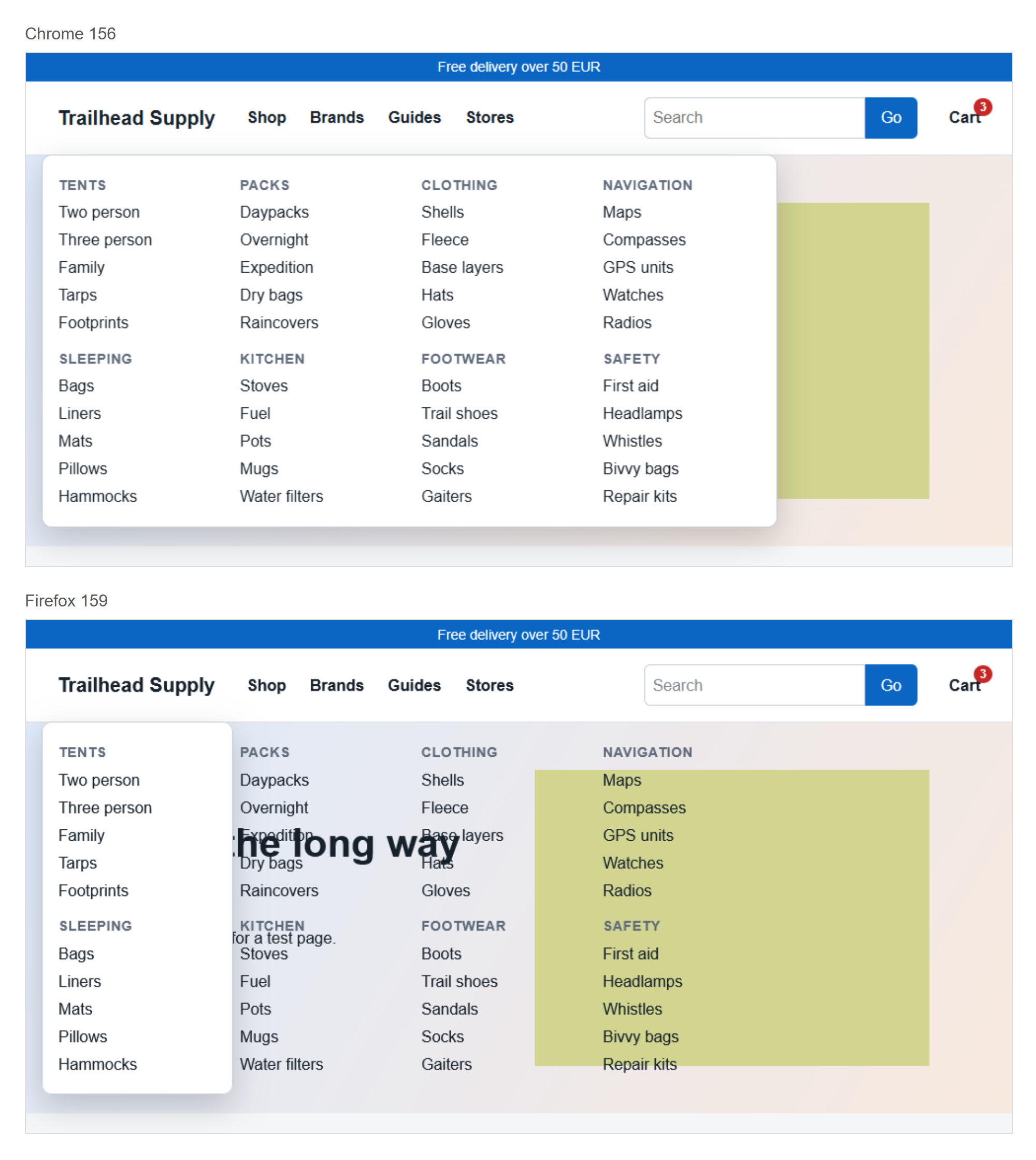
Chrome 156 fits all four columns inside the panel. Firefox 159 and Playwright’s WebKit 26 make the panel one column wide and leave the other three outside it. The Flexbox spec sets the max-content width of a wrapping column container to “the sum of the flex line cross sizes”, so Chrome is the one following it.
Firefox has bug 995020, opened in April 2014, and WebKit has bug 157648, opened in May 2016. Both were still marked NEW when we checked on 8 November 2026. Chromium’s issue 40425575 is marked Fixed.
The reduction, step by step
Each row is one pass of a script. After every pass the page was loaded in all three browsers and given the same check: do the panel’s children sit in at least two columns, and does the rightmost one pass the panel’s right edge by more than a pixel? A yes shows how far it went past. A deletion stayed only if Chrome still said no and the other two still said yes. Otherwise the script put the piece back. It tried 264 changes in all.
| Step | Elements | CSS rules | Chrome | Firefox | WebKit |
|---|---|---|---|---|---|
| The page as built | 452 | 274 | No | Yes, 535px | Yes, 535px |
| Delete the scripts (undone) | 451 | 274 | No | No | No |
| Save the page as rendered, then delete the scripts | 451 | 274 | No | Yes, 535px | Yes, 535px |
| Delete top-level sections, one at a time | 122 | 274 | No | Yes, 535px | Yes, 535px |
| Delete CSS rules that match nothing on the page | 122 | 36 | No | Yes, 535px | Yes, 535px |
| Try deleting each remaining CSS rule | 122 | 5 | No | Yes, 263px | Yes, 263px |
| Try deleting each remaining element | 34 | 5 | No | Yes, 61px | Yes, 61px |
| Try replacing each element with its children | 27 | 5 | No | Yes, 61px | Yes, 61px |
| Delete whitespace between elements | 27 | 5 | No | Yes, 61px | Yes, 61px |
| Try deleting each attribute | 27 | 5 | No | Yes, 61px | Yes, 61px |
| Try lifting rules out of media queries | 27 | 5 | No | Yes, 61px | Yes, 61px |
| Try deleting each CSS rule again | 27 | 4 | No | Yes, 125px | Yes, 125px |
| Try deleting each CSS declaration | 27 | 4 | No | Yes, 54px | Yes, 54px |
| Try deleting each element again | 15 | 4 | No | Yes, 40px | Yes, 40px |
| Replace custom properties with their values | 15 | 3 | No | Yes, 40px | Yes, 40px |
| Rewrite by hand with fixed sizes and no text | 3 | 2 | No | Yes, 50px | Yes, 50px |
The second row is a trap we left in. A script opens the menu, so deleting the script at the start closed the menu, and the bug vanished from all three browsers with 451 elements still on the page. Saving the page after the script had run put the open state into the markup, and then the script could go.
Two passes did most of the work. Deleting whole sections took the page from 451 elements to 122. Deleting rules that matched nothing took CSS from 274 rules to 36 and cost one reload.
The overflow fell from 535 to 40 pixels as columns disappeared. Only the pattern has to hold. The declaration pass said the most about the cause: of 22 declarations it removed 16. What survived was flex-flow: column wrap, display: flex, position: absolute, max-height and the two custom properties feeding that height. The will-change, z-index and gap we had planted as suspects all went.
A loose check finds the wrong bug
We ran the same script again with a lazier check: is the panel a different width in Firefox and Chrome? It stopped at 4 elements and 2 rules, and the bug was gone. The file had no flex-flow left. Two headings sat side by side, and the panel measured 112.03 pixels in Firefox against 112.02 in Chrome, which is text rounding. A reducer keeps whatever passes the check, so write the check to describe the bug you are chasing.
 Photo by Sergei A
What the bug depends on
With the final file we changed one thing at a time. The first six rows still show the bug in Firefox and WebKit, and the rest do not.
| Change | Chrome | Firefox | WebKit |
|---|---|---|---|
| The final file, unchanged | No | Yes, 50px | Yes, 50px |
| height instead of max-height | No | Yes, 50px | Yes, 50px |
| display: inline-flex, no position | No | Yes, 50px | Yes, 50px |
| float: left, no position | No | Yes, 50px | Yes, 50px |
| Add width: max-content | No | Yes, 50px | Yes, 50px |
| Add width: fit-content | No | Yes, 50px | Yes, 50px |
| Remove flex-wrap | No | No | No |
| Remove max-height | No | No | No |
| Remove position: absolute | No | No | No |
| Add width: 150px | No | No | No |
| Use grid with grid-auto-flow: column | No | No | No |
| Use multi-column layout | No | No | No |
width: max-content doesn’t help, since max-content is the value those two engines work out wrongly. For a menu you need today, set a width yourself, or use grid or multi-column layout. Grid needs the row count and columns need the column count, so both trade away some of the automatic flow.
This is the whole file:
<!doctype html>
<meta charset="utf-8">
<title>Column-wrap flex container sized as one column</title>
<style>
#shop-menu { position: absolute; display: flex; flex-flow: column wrap; max-height: 100px; background: gold; }
#shop-menu div { width: 50px; height: 60px; background: teal; }
</style>
<div id="shop-menu"><div></div><div></div></div>
How to reduce your own
- Save the page as one local file and confirm the bug shows there. If a script changes the page, copy the HTML from the Elements panel after it has run.
- Write down a check you can repeat, ideally one number read from the console. For us it was the rightmost child against the panel’s right edge.
- Delete big pieces first: whole sections, then stylesheets, then scripts.
- Go through the remaining CSS rules one at a time, then the elements, then attributes and single declarations.
- Undo any deletion that changes the result. Whatever you had to put back is your list of causes.
- Check the other engines after each round. On Windows, see Safari on Windows for the WebKit side.
- Replace text, images and variables with fixed values by hand and test once more. Keep the doctype so the file stays out of quirks mode.
Where to report it
Search first. This bug has an open report at both vendors, and Mozilla closed another report as a duplicate of it in July 2026, so we did not file a new one. On an existing bug, a comment with your test case is the useful move.
- Chromium: new issue form. The guidelines ask you to check other browsers and attach a simplified test. Layout bugs sit under Blink, Layout.
- Firefox: Bugzilla, product Core. Mozilla’s writing guidelines ask for a reduced testcase attached to the report. If you lack the time, they send you to webcompat.com.
- WebKit: new bug, component New Bugs. The guidelines want the file attached, without a link to a server, and a separate guide covers reduction.
All three forms asked for a sign-in when we opened them on 8 November 2026, so you need an account at each. A report for this bug would read:
Title: Column wrap flex container is one column wide when sized by content

Open the attached file.
Expected: the gold box is 100px wide and holds both teal boxes.
Actual: the gold box is 50px wide. The second teal box is outside it.

Firefox 159.0.1 and WebKit 26.0: 50px. Chrome 156.0.8078.80: 100px.
Windows 11. Spec: https://www.w3.org/TR/css-flexbox-1/#intrinsic-cross-sizes
How this was tested
A script ran the reduction on 8 November 2026 in a 1000 by 800 pixel window on Windows 11. The bloated page was generated for this test and contains no real shop.
- Chrome 156.0.8078.80, headless.
- Firefox 159.0.1, headless.
- WebKit 26.0 from Playwright. This WebKit build is not Safari, and nothing here was run on an iPhone.
The script only deletes, except for the row that swaps custom properties for their values. The last row was written by hand and put through the same check. The full output is available as raw JSON. The test script and this article were prepared with help from AI.
How this used to work
Browsers disagree because each engine is separate code, written against a spec that also moves. In 2014 Firefox assumed no wrapping, while Chrome assumed every item might wrap and could make a container four columns wide around a single column. A 2015 Chromium report lists Edge as correct and Chrome, Firefox and Safari as failing. The spec rule was reworked after CSS Working Group issue 6777 from 2021, and Chromium has since changed its sizing.
Common questions
How small is small enough?
Stop when deleting any remaining line makes the bug go away. Ours ended at 342 bytes.
Do I need a test case to report a bug?
Chromium and Mozilla both ask for one where you can make it. Without one, Mozilla points you to webcompat.com, where volunteers do the reduction.
If one browser differs, is that browser wrong?
Read the spec before you decide. Here Chrome was alone against the other two, and Chrome matched the spec.